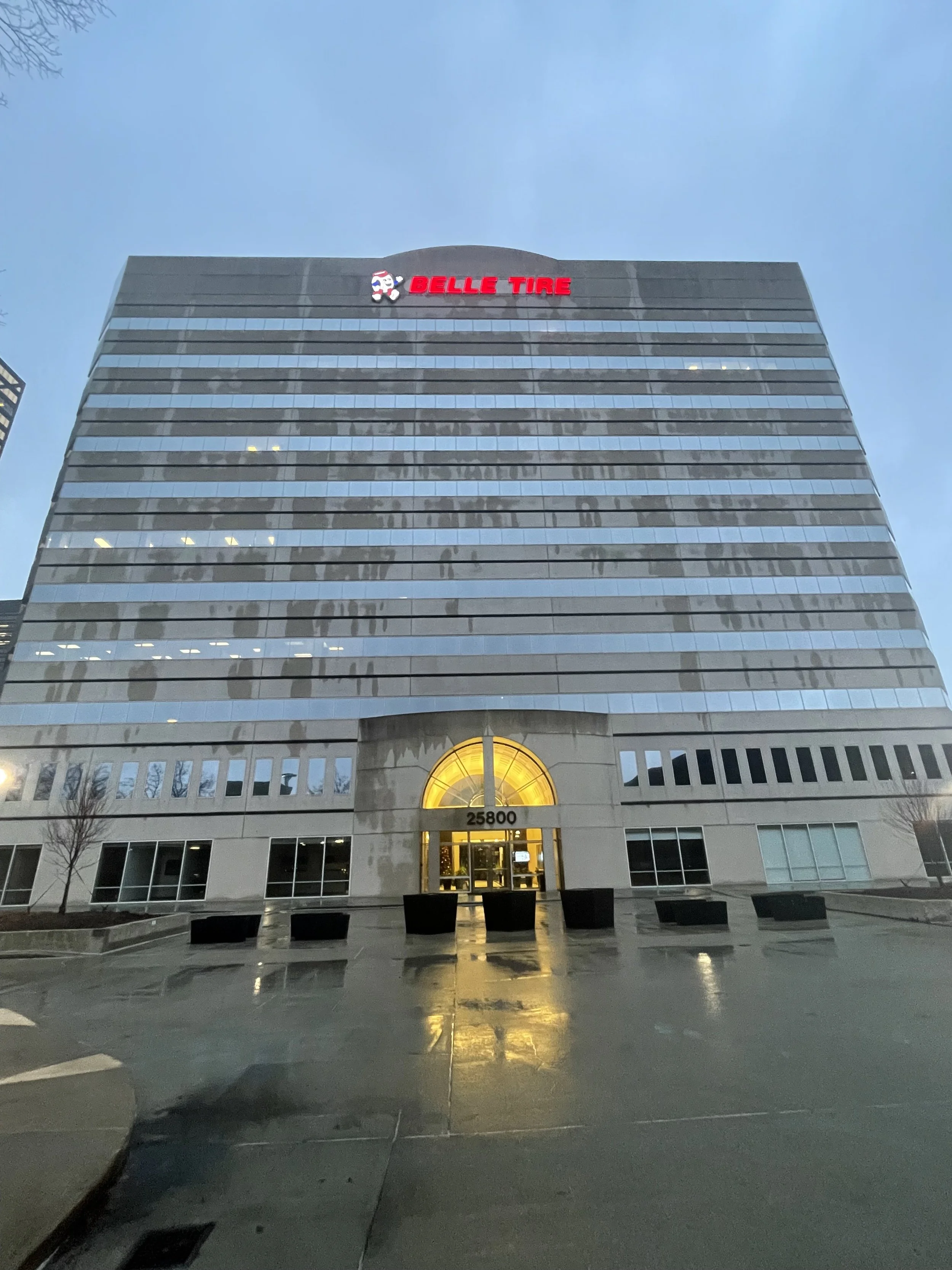
You are observing Belle Tire’s Corporate Headquarters; the building I worked out of during my priceless time there as a full-time User Experience Analyst.
Did you know? Belle Tire is the Midwest’s largest tire retailer, with daily revenue north of $2M!*
*Due to a non-disclosure agreement, my full work cannot be published, but feel free to view a glimpse!
Recommendation: To revise the primary CTA button on the Homepage
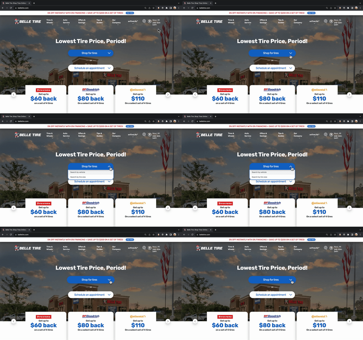
During my first month, I presented a strategic recommendation to the senior leadership team to change the wording of their primary call-to-action button on the homepage. After deploying the A/B test, the transition from their original phrasing "Search for a tire quote" to "Shop for tires" saw a remarkable +26% higher engagement rate (which theoretically translated to a +$410,000 increase in online revenue per annum) than they previously witnessed.
My explanation to leadership for that change was that “Search for a tire quote” carries a connotation of a high expense, whereas “Shop for tires” is simple, and direct. Therefore, significantly directing user guidance and encouraging action. Thankfully, the company swiftly adopted my recommendation (as you can see above).

